Monday, September 26, 2011

The Cubbyhole on the Peninsula


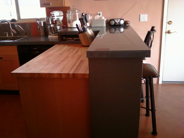
I wanted to incorporate a butcher block counter top on the peninsula, but I did not want some awkward spot where the two different counter top mediums joined. So...I designed the peninsula so that a raised L-shape at bar height would surround a standard counter top height butcher block section. I decided to use that little bit of extra space as a cubbyhole for my husband's marble pastry board. That sucker is HEAVY, so it is nice to be able to slide it out onto the butcher block. There's actually a little extra space in there. I also store a rolling pin, a few very long grill utensils, and the scraper that I use to clean the butcher block. I considered having the butcher block extend into the cubbyhole, but then decided that I didn't want to have anything installed directly on the butcher block. The way the butcher block is installed, it is relatively easy to remove. I actually use it for cutting stuff on, so someday I may want to flip it over to get a new clean surface, or replace it altogether.

The bottom of the cubbyhole is tile, level with the adjacent countertop. The sides and back of the cubbyhole are made of wood, the exterior is painted high-gloss grey like the butcher block backsplash, and the interior is stained. The top of the cubbyhole is tile, and  level with the bar height counter top.

You can see pretty well in these pictures that there are actually 3 counter top heights. The lower tile counter top height is just over 37" high. I can't quite remember why we couldn't make it 36"...probably because of the roll-out grey cabinet. Then we put the bar height at just over 42" to get close to the standard bar height. We had to make the butcher block the standard 36" instead of making even with the lower tile counters so we could have room to fit the electrical outlets on the backsplash behind the butcher block. This was a last minute design change, because I hadn't allotted enough space for the outlets. Originally, I wasn't going to put outlets, but code says they have to be there every 4 feet or something ridiculous like that anywhere there is a kitchen counter top. They don't want anyone having to use an extension cord to plug in an appliance. I will probably never even use those outlets.

As it turned out, I like the look of the 3 different levels of counter top, and since the butcher block is used for cutting, it is more comfortable to have it at the standard 36" height.

Friday, September 16, 2011

Raising the Ikea Pantry Cabinet (High Cabinet)


The pantry cabinet needed to be raised by about 3/4 of an inch beyond what my 6 inch capita legs would allow. A 3/4 inch block of plywood was put above each leg. A deco strip was put beneath the cabinet to hide the plywood. Because this cabinet is not right next to any other cabinet, you don't notice the difference. I could have also gotten the 8 inch capita legs and cut them, but the closest Ikea is about 2 hours from my house, and it wasn't worth going back to get different legs. I would have wanted to have the deco strip anyway, because the legs would have looked so much longer than the other legs in the kitchen.

I see on the IKEA FANS forum that others also need to raise the pantry cabinet.

One of the reasons the cabinet needed to be raised was because when the cabinet above the refrigerator was lined with the top of the pantry, the space for the refrigerator was too short. Ikea only makes a 15 inch tall wall cabinet for over the refrigerator. Many other cabinet manufacturers make a 12", which would have allowed for the refrigerator to fit.

Increasing the height of the upper cabinets also allowed for more space between the counter top and the bottom of the upper cabinets. I have 18 1/2" space, which works well. I think the standard is 18". Without the extra 3/4" it would have been less than 18", and I may have had an issue fitting my blender on the countertop underneath the upper cabinets.

Thursday, September 15, 2011

Ikea Cabinet on Casters


I wanted a roll-out piece in order to access the corner space. Ikea doesn't make castors for the Akurum line of kitchen cabinets. I bought the casters at Ace Hardware. I think they were rated for 75 pounds or something. This small cabinet wasn't intended to hold anything too heavy, and the butcher block top is not that heavy. I needed casters small enough that the cabinet would still clear under the counter top. I was all set to go to a specialty caster store, but the owners were on vacation and I was too impatient. I probably could have gotten heavier duty casters that would have been a small enough diameter.

I have braking casters for the front two, although I haven't needed to actually use the brakes -- it's been at least 6 months now I think. The weight of the cabinet seems to hold it in place fine if I am just opening drawers. You may notice I got a different style than the rest of the cabinets. That is because the casters are shorter than the legs (so that the cabinet will roll under the counter top), cabinet doors/drawer fronts don't line up. I thought it would look strange for 2 Adel style cabinets to be side-by-side and not line up, so I went with a totally different style (ABSTRAKT high gloss gray).


One of the casters is screwed directly to the cabinet. The other 3 are shimmed so that the cabinet sits level in its space. My floor is not at all level. This means that when the cabinet is rolled out, it is not level. But there's nothing to be done about that...my floor is the problem there. This has worked out very well, although I would be hesitant to try it on a bigger cabinet, or for a cabinet that was to carry a heavy load.

Tuesday, September 13, 2011

The Venetian Plaster Backsplash


The picture above shows what the Venetian Plaster looks like. I got Valspar (the Lowe's brand), which is not truly Venetian plaster, but a "faux Venetian plaster". As you can see there is some subtle texturing, and even more subtle color variation. I applied 3 layers of the plaster with the venetian plaster spatulas sold at Lowes. It was actually not too difficult, and only used about half a gallon of the plaster. It made for a cheap backsplash, less than $100 altogether. I'm mostly happy with it.

I did not burnish, which would have caused more color variation. I did a trial patch which I burnished, but it looked really terrible. I tried with the plaster tools, sandpaper, and with a stainless steel trowel. Beware using regular stainless steel with the venetian plaster, because it leaves dark marks. I guess that is why the venetian plaster tools are all made from some kind of blue steel. The burnished portion that I tried did not look like any of the pictures of venetian plaster that I have seen, and I'm not sure what I may have done wrong. It looked really streaky and harsh, not at all marble-like.

Valspar makes a protective coat for the plaster, but I did not use it. I bought some, and tested it out. I think it is intended for walls that would not be washed frequently, because when I tried washing the area where I used the Valspar protective coating, the water soaked through the finish and some plaster rubbed off as well. Instead, I used Seal-Krete high gloss Showroom Finish, which is a concrete floor coating. I can wash the wall, and the plaster is not affected. It also made the plaster nice and shiny.

I have had two problems with the plaster. First, a piece chipped off behind the sink. I think perhaps a utensil may have gouged the wall. I tried several times to patch the spot (I have plenty of leftover plaster and seal-krete), but there was no way to make it look nice. It was always an obvious and ugly patch spot. This may be where more variation in color would have been good, because maybe it would be easier to conceal patch spots. Eventually I gave up and we put up a stainless steel backsplash. There is a picture and description of that here: http://uniquekitchenideas.blogspot.com/2011/09/kitchen-overview-east-wall-stainless.html

Below you can see the second problem I have had with the venetian plaster backsplash. There is a bump in the wall. I suspect it is a drywall screw that somehow decided to back out. I've got 2 pictures below, the bottom one is a close-up. I have no idea what to do to fix this. I have already determined that a patch will not work, so I can't chip away at it and put the screw back in. It's also not really in a nice spot to put another stainless backsplash in. It's pretty close to the sink, under the paper towel dispenser. For now, I just put something in front of that spot to hide it.


Update Dec 2014: It has now been a few years, and besides the initial problems mentioned, the backsplash is holding up very well. After the first 2 years, I re-coated with the Seal-Krete high gloss Showroom Finish to keep it protected.

Friday, September 9, 2011

Solving the Corner Cabinet Dilemma


I hate to have wasted space in the corner. Usually the solution to a corner cabinet is either a blind cabinet, which makes it very hard to get into the back corner, or some type of lazy susan which wastes a lot of space. I put a partially hidden cabinet in the corner. The grey cabinet was put on casters so that it rolls out easily. I'll talk about that cabinet more in a future post. In the opposite corner (no picture), I have the wine fridge on sliders so that it pulls out easily as well.


Even without moving the grey set of drawers, I can get into the corner cabinet to access some pans.


The corner cabinet was made from a regular ikea base cabinet frame, and the door is a 12" ikea door to match the rest of the doors, but it slides instead of opening on hinges. Instead of a handle like the other cabinets, this one has a knob purchased from Home Depot. I put stuff in the back of this cabinet that I don't need to get at very often, like these large bags of rice and flour. The divider that the pans are leaning against was purchased from Ikea.


The picture above is a close-up of the bottom track. It is made of wood, and waxed with Johnson Paste Wax. The door slides pretty easily in the track. The picture below is of the top of the door.

Thursday, September 8, 2011

The Peninsula & The Butcher Block Countertop


The south edge of the kitchen is bordered by a peninsula. The peninsula consists of two sections. The section with the butcher block is regular counter height (36"). The raised L-shaped section with the tile is 42" high (standard bar height). The lower part of the peninsula consists of ikea cabinets, with the butcher block countertop affixed to the top. The cabinets extend all the way back to the east wall. The raised portion was custom built from plywood, and painted with a high-gloss grey paint (to match the grey pull-out drawers on the east wall). I was originally going to try to put venetian plaster over the plywood instead of painting it, but after working with the plaster I figured it probably wouldn't go over plywood easily, and I was afraid it would flake off or something. You can see a cubby hole at the far end of the butcher block. There will be further details on that in a later post.

The maple butcher block was purchased from Lumber Liquidators. I purchased an 8 foot section for $259, but I only needed about 4 feet. I used some of the remainder to top the grey pull-out drawers on the east wall. I use the butcher block as a cutting board. It works really well. It's easy to clean (scrape off the food bits, spray with vinegar, and wipe down). About once a week I oil it with food grade mineral oil. You don't need special butcher block oil. It is much cheaper to get at the drug store or grocery store. They even have it at Target. But you have to look in the medicine section with the laxatives, because it is sold as an "intestinal lubricant". You can buy a 16 oz bottle for as cheap as a couple bucks.

Monday, September 5, 2011

Kitchen Overview - East Wall & The Stainless Backsplash & the Dishwasher


The east wall has the a stainless steel sink with satin nickel faucet, dishwasher, and a set of drawers that roll out from under the counter (more on that in a later post).

Most of the backsplash is the Venetian plaster. However, the constant water and abuse from the area where the sink is created a blemish, and we decided to add a stainless backsplash for behind the sink. My husband went to a metal shop and they made a thin sheet to our specs for about $20. It was really much cheaper than I had imagined. I don't know that I would want the entire backsplash to be stainless steel, because of the difficulty keeping it clean, but for the area behind the sink it really works well.

The dishwasher is a Bosch, one of the quieter models. My husband wanted an Asko, but I didn't want to spend that kind of money. I found that if I used cheap dishwasher detergent that the dishes didn't clean well (the Kirkland liquid stuff). We buy those Finish tablets, and they seem to work pretty well. But now I have 2 huge bottles of the Kirkland. I use it sometimes if I have a load of dishes that isn't very dirty. Also, when the dishwasher is done, many dishes usually aren't all the way dry. This is the first dishwasher I've ever had, so I don't know if that is normal or not.

Sunday, September 4, 2011

Kitchen Overview - West Wall & The Refrigerators


On the west wall, there is a 24" wide 80" tall full depth pantry cabinet. I have one of those removable 3M Command hooks holding the apron on the side. There's room for some storage above the cabinets. I put some liquor bottles and a basket up there. You can see some of the cabinets on the north wall that are a little higher (at the 88" level). The ceiling slopes up, so we could go higher with the cabinets on the north wall.

We have a an EdgeStar 30 Bottle Built-In Wine Cooler Refrigerator under the counter in the corner. The fan seems to cycle on and off quite a bit, but I emailed the company and they said that it is supposed to work that way. It's a little noisy, but I don't notice it anymore.


The refrigerator is a Frigidaire Gallery FGHB2844LE2 french door model. I'm not sure I'm thrilled with the french door style. I got it because I dislike side-by-sides and I wanted the water & ice dispenser option, which doesn't tend to come on top/bottom freezer styles. Also, we wanted a large refrigerator, and the largest tend to be french door models. A left-hinged door would have been better, since the counter is to the right of the fridge. With the french doors, you kinda want an island or something where you can put stuff when loading/unloading the fridge.


The ice/water dispenser: The crushed ice isn't very crushed, but it is crunched a bit. The water works great, it reminds you when to change the filter as well. The ice dispenser doesn't dispense very fast, and jams up occasionally. 


I wish I hadn't gotten a refrigerator with the smooth/shiny finish. It shows smudges and fingerprints easily. But the rougher finish isn't so popular anymore. I guess the textured finish on a refrigerator just isn't considered stylish. Everything has to be shiny & sleek now. The black plastic drip tray below the dispenser also shows water deposits pretty badly. I would pay a few bucks if I could get a drip tray made of stainless or maybe some kind of ceramic or glass. It's just so difficult to clean the hard water deposits from plastic.

Friday, September 2, 2011

Kitchen Overview - North Wall & The Porcelain Tile


The IKEA cabinets are the Adel Beech variety with low-profile handles that have since been discontinued. The tiles on the countertop are 24" square polished blue porcelain, with matching blue grout in between. The backsplash is created from the Valspar Venetian Plaster, covered with Seal-Krete Hi Gloss Premium Showroom finish.

I love the porcelain. It is so easy to clean. I use Fabuloso Ocean Cool Scent Commercial strength that I purchase from Home Depot. As far as I can tell, that is the only variety of Fabuloso which is food safe. You can use anything to clean the tile, it is indestructible. The grout is more picky. You need to use a pH neutral cleaner for the grout, so that is why I use Fabuloso instead of vinegar to clean. I used to use vinegar for everything, then I found out it not only damages grout, but it can also damage stainless steel. 

I only have one complaint about the tile. There were a few pieces which were defective. If you look at them from a certain angle, you can see a slight pattern of the bottom of the tile which was sitting on top of it while it was stored. It is very faint, and I cannot even get it to show up in a picture. I wish I had cleaned all of the tiles thoroughly and examined them before installation. We had plenty of extra tiles, and I could have trashed the couple that were defective, except I didn't clean the tiles until after installation, so I didn't know the defect was there until it was too late. All in all, the defect is minor, and it is really barely noticeable.

Another great feature of porcelain: you can set hot stuff from the oven right on the counter. There's not really anything you can do to damage porcelain, since it is so strong. I was initially deciding between Corian, granite, stainless steel, and porcelain for the counters. Porcelain tile was by far the least expensive option, especially for a DIY job. The materials cost for the entire counter was about $500. It would have been between $2000-$5000 for the other options. I decided against Corian because I wanted something that could handle hot pans from the oven. Stainless steel is not so easy to keep clean, and it is expensive. Granite would have been my next choice, but it is also expensive. I also didn't like the thought that if something did happen to the granite (however unlikely it may be there is the possibility of cracking or staining), then you have to replace the entire slab. Tile has the downside of grout lines, but then if something happens, you can chip out the tile and replace just that piece.